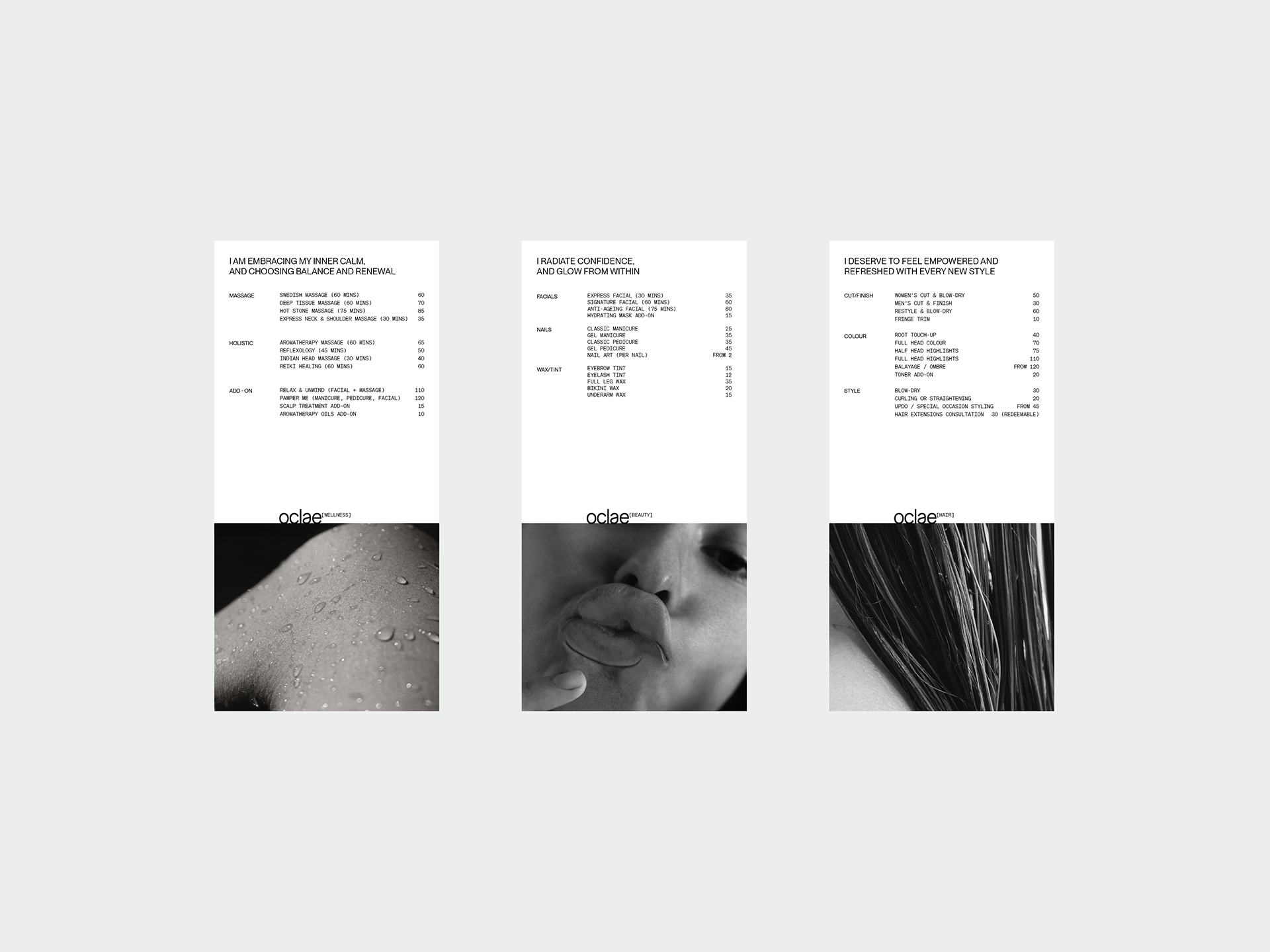
Menu
Role:
Brand Identity
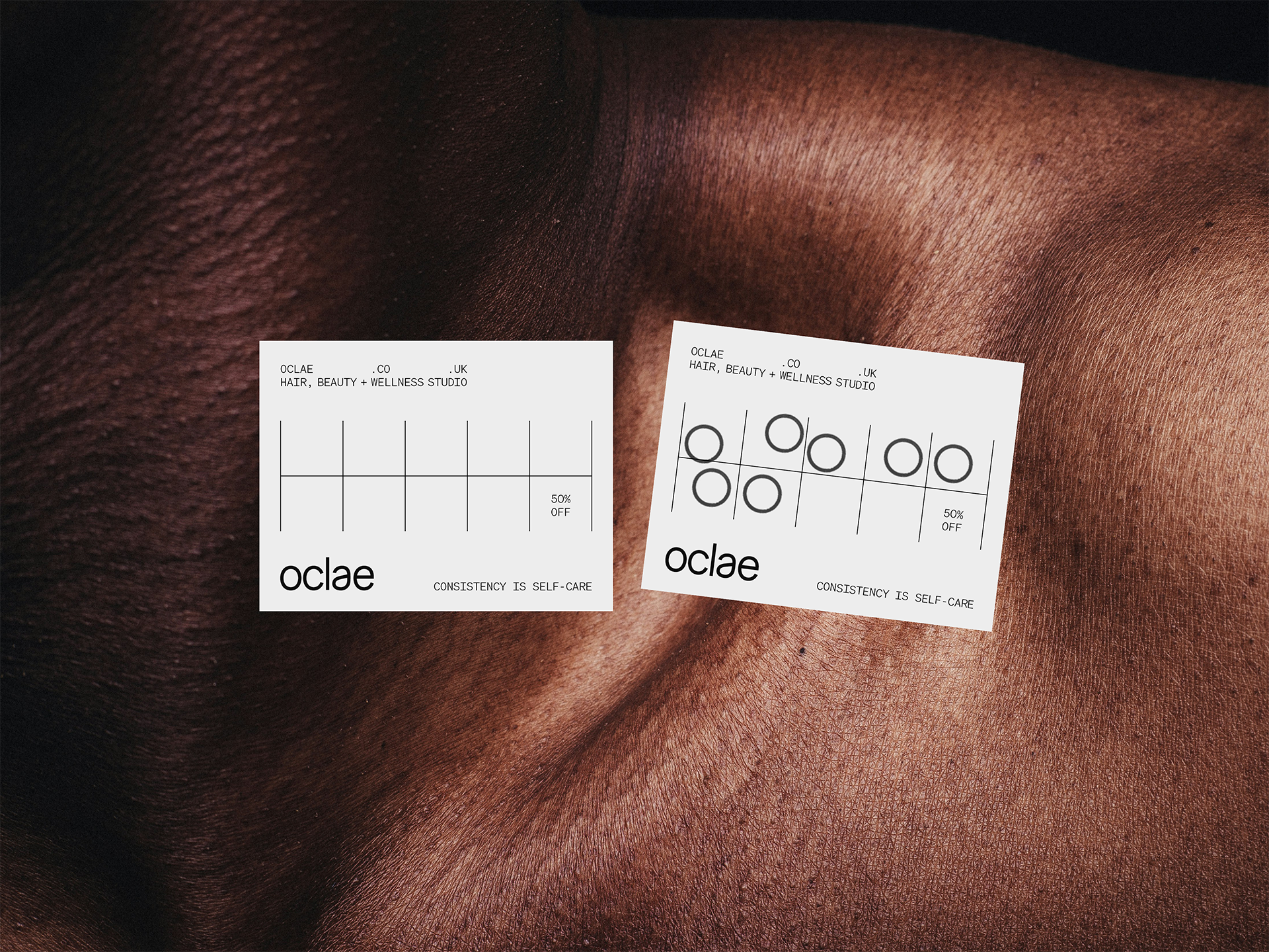
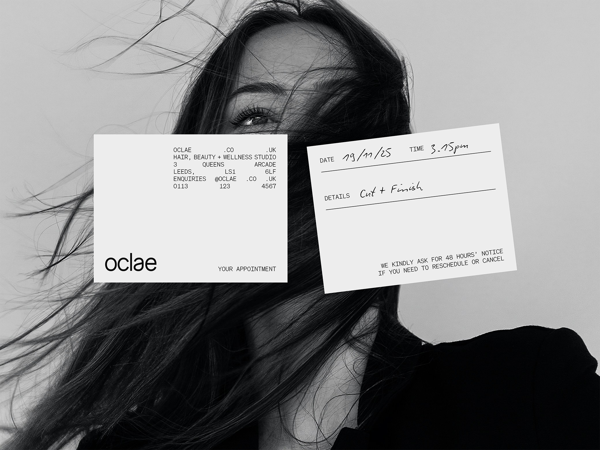
Collateral
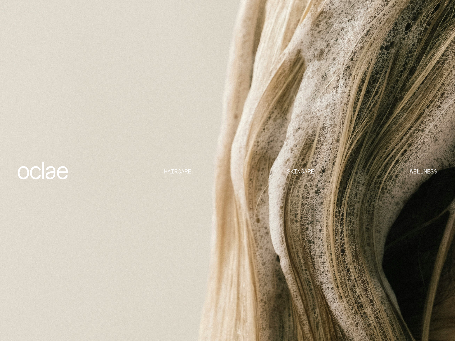
Packaging
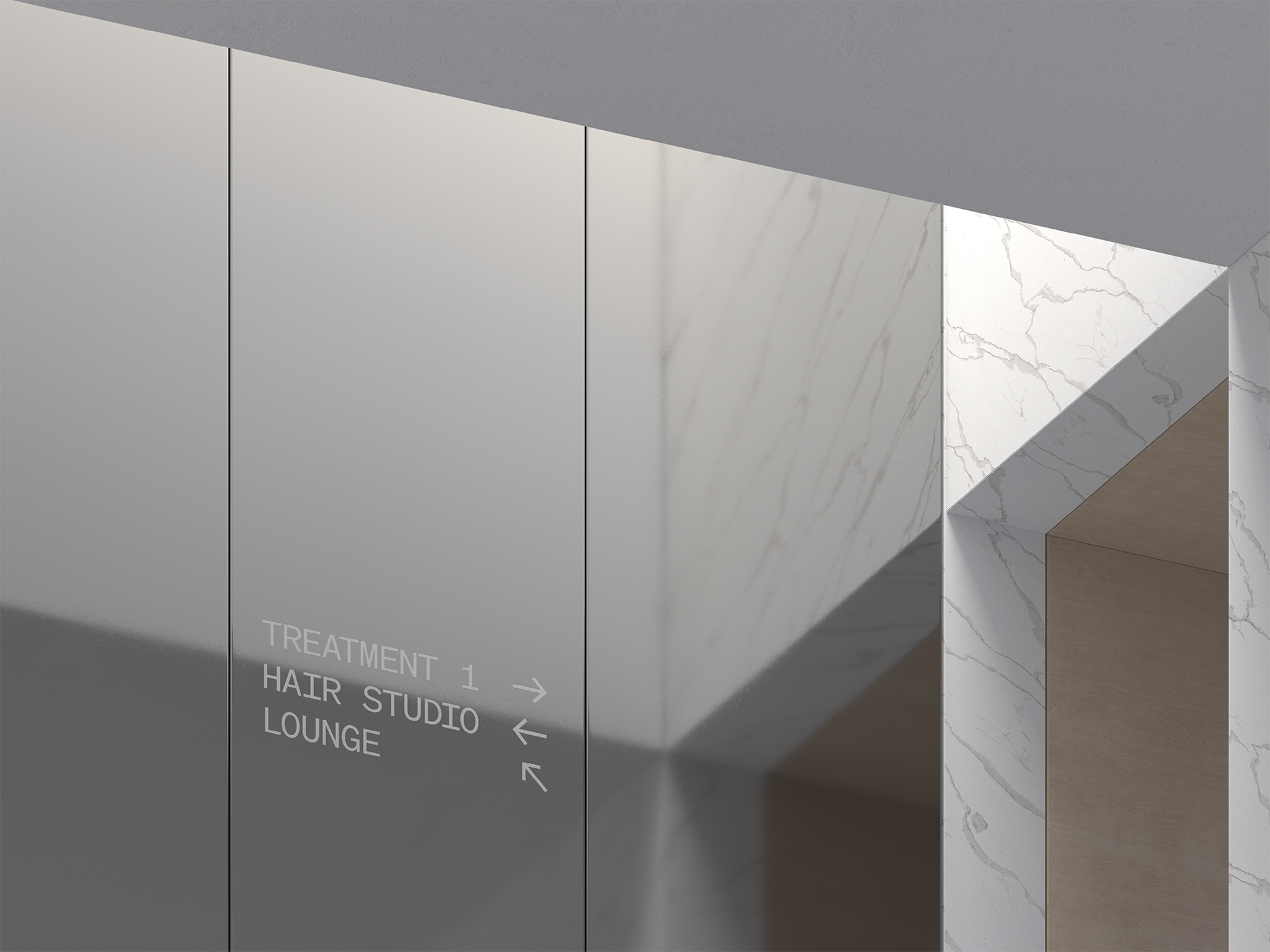
Wayfinding
Date:
April 2025
Credits:
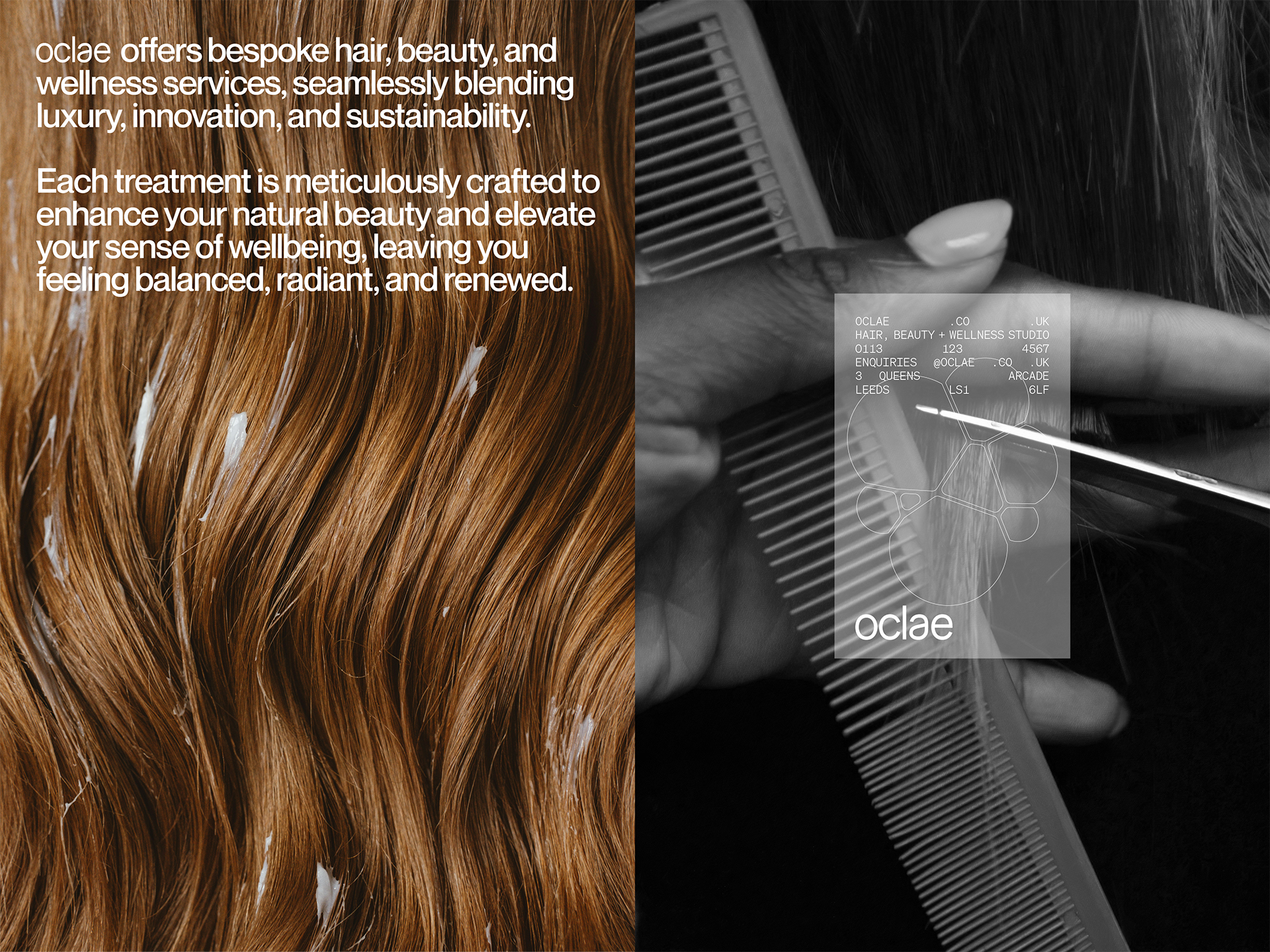
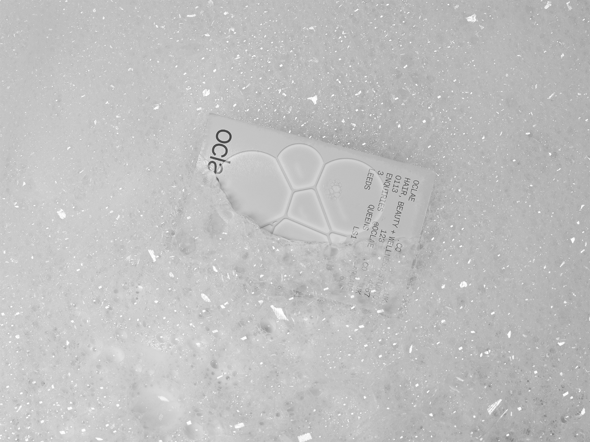
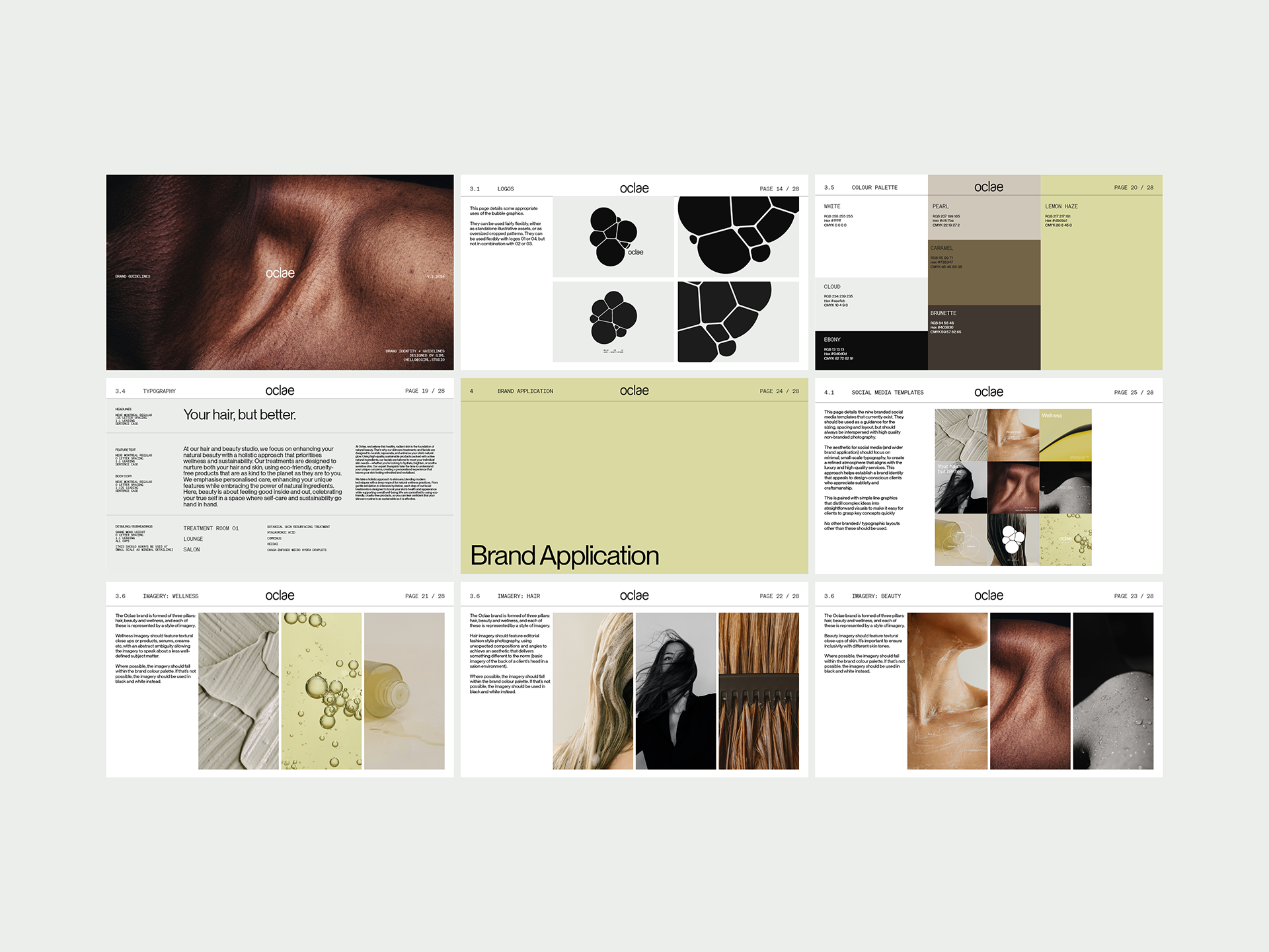
Naming, brand strategy, brand identity, print, packaging, signage and digital design by GIRL. The name “Oclae” was created by us, loosely inspired by the French word éclat, meaning glow. It’s a space where creativity and calm come together, and clients leave feeling restored.
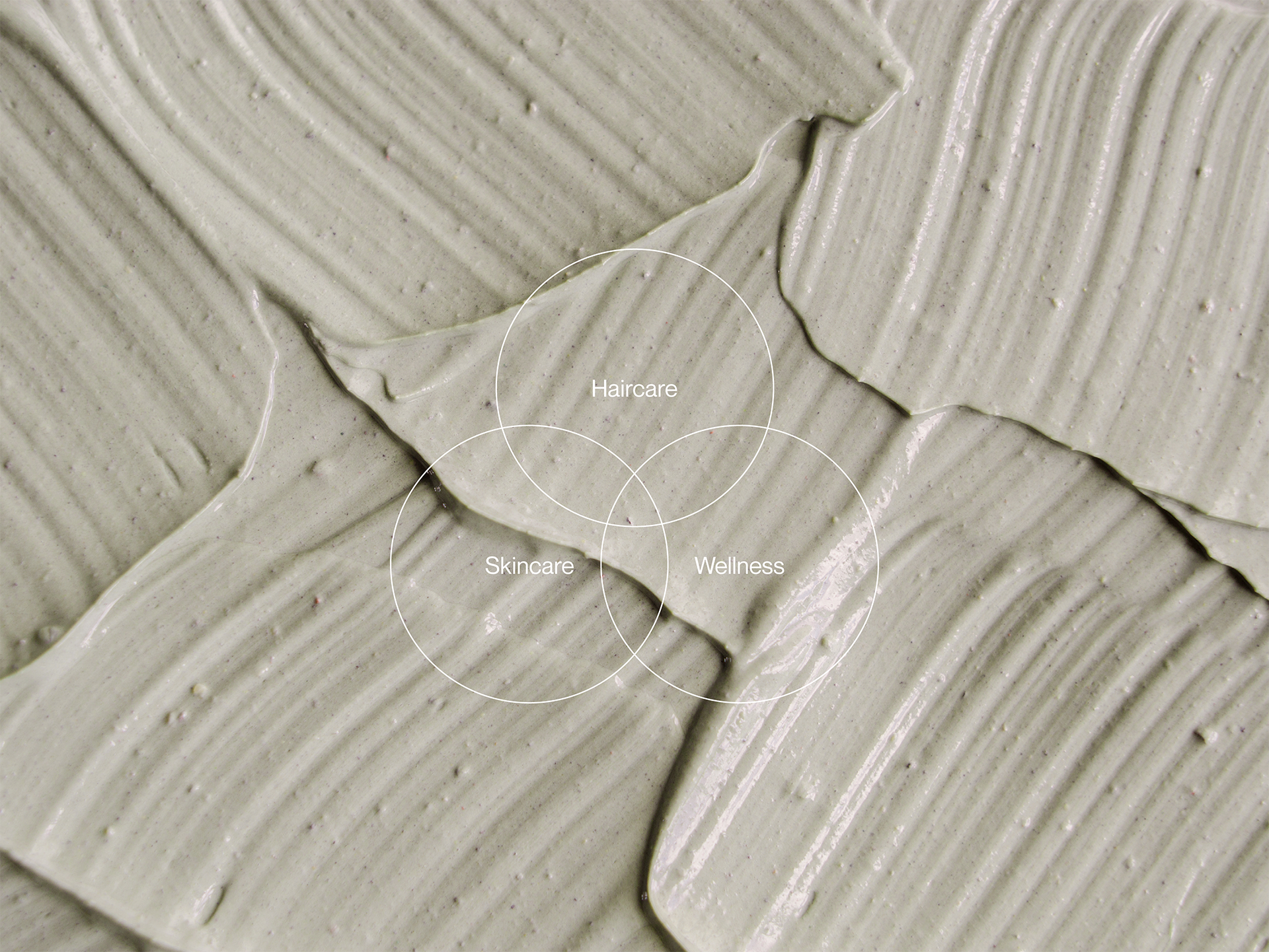
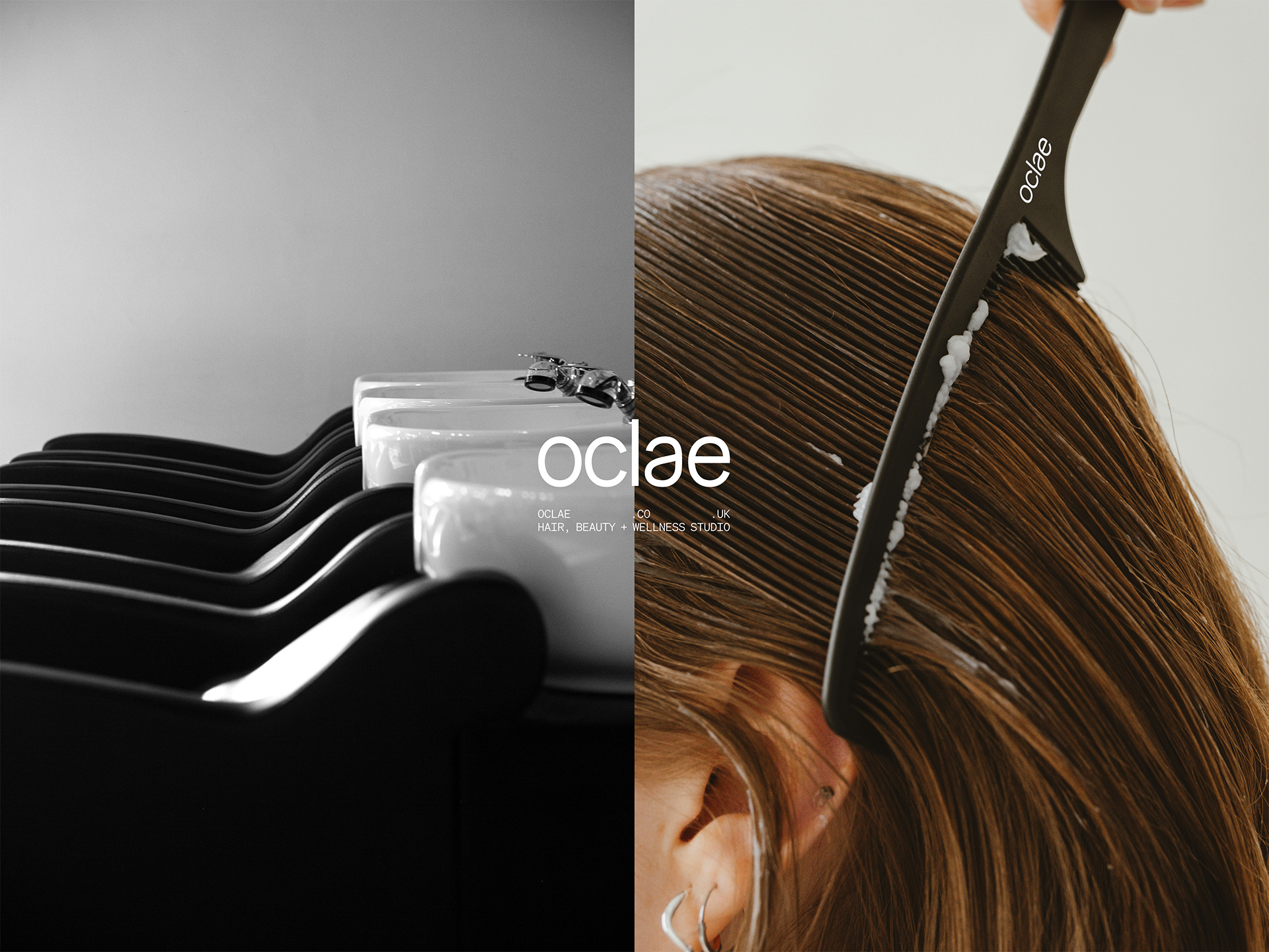
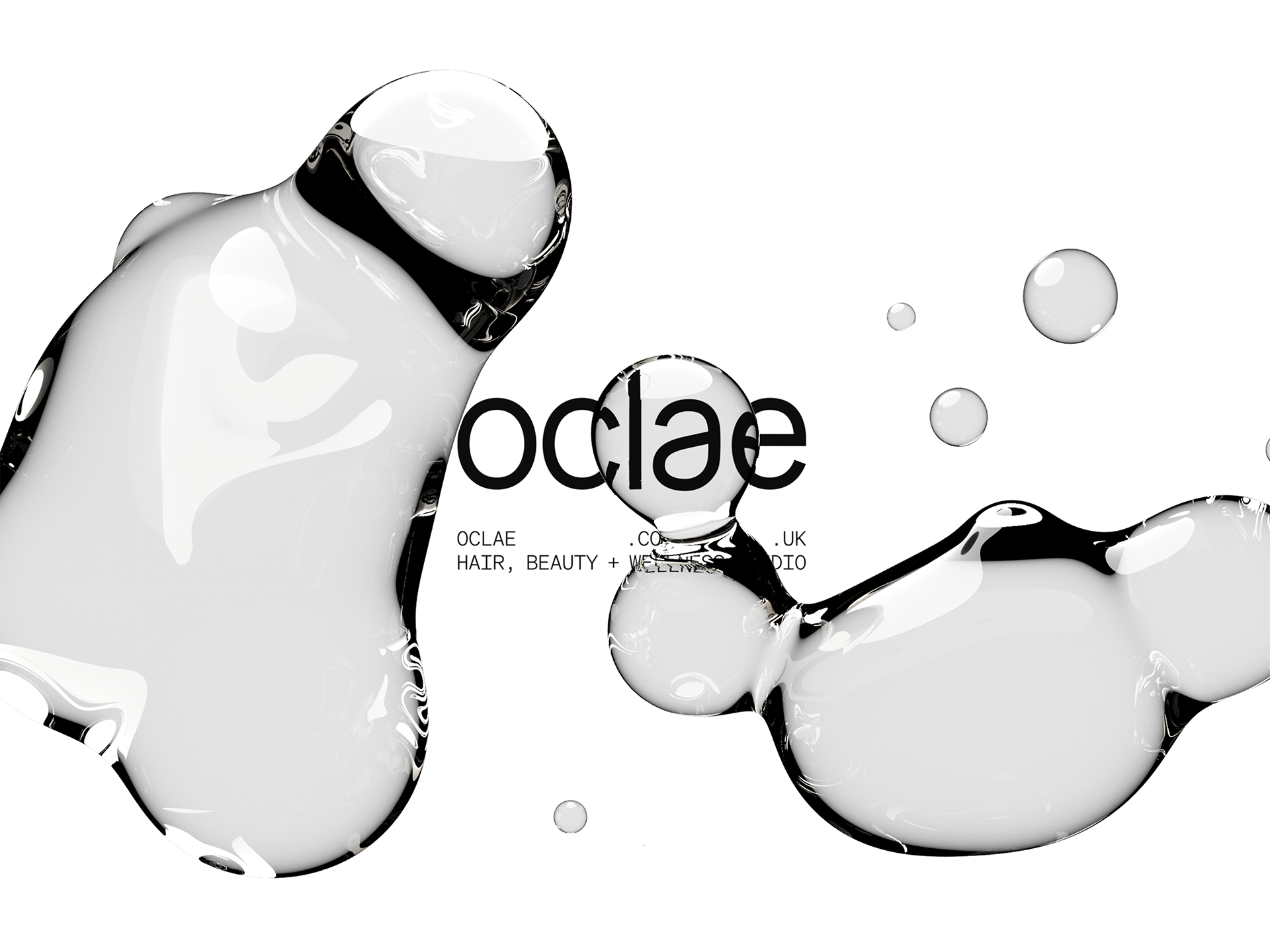
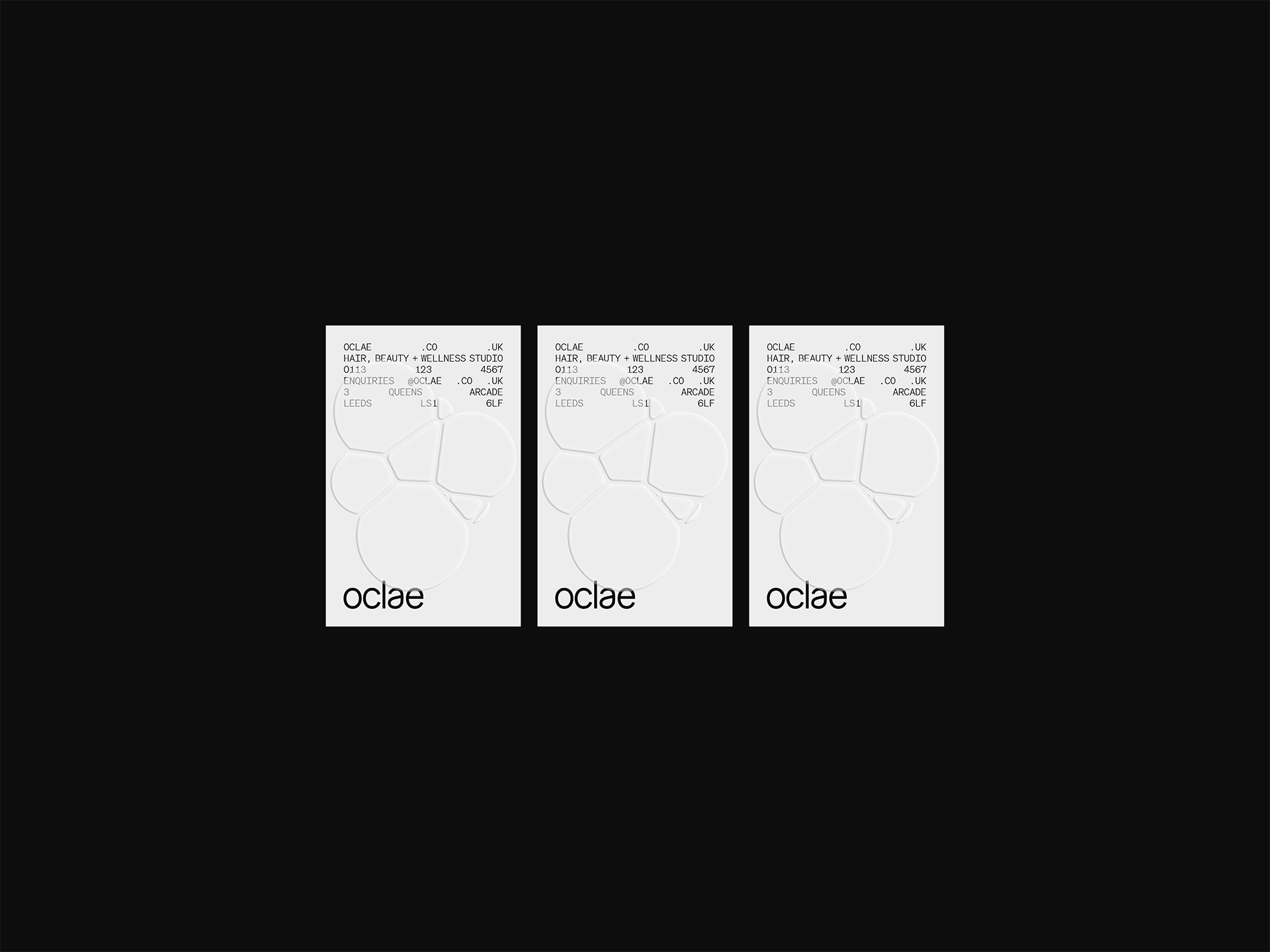
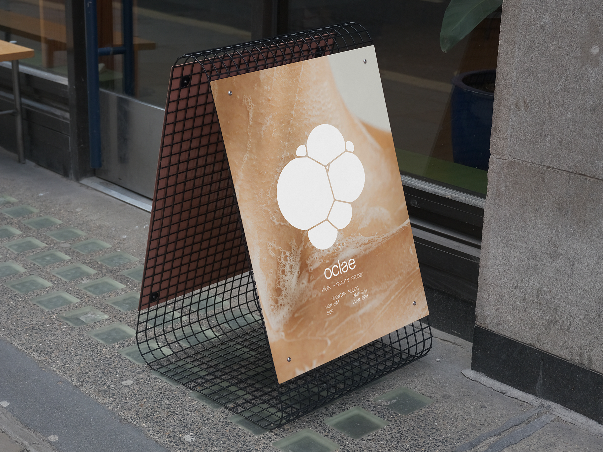
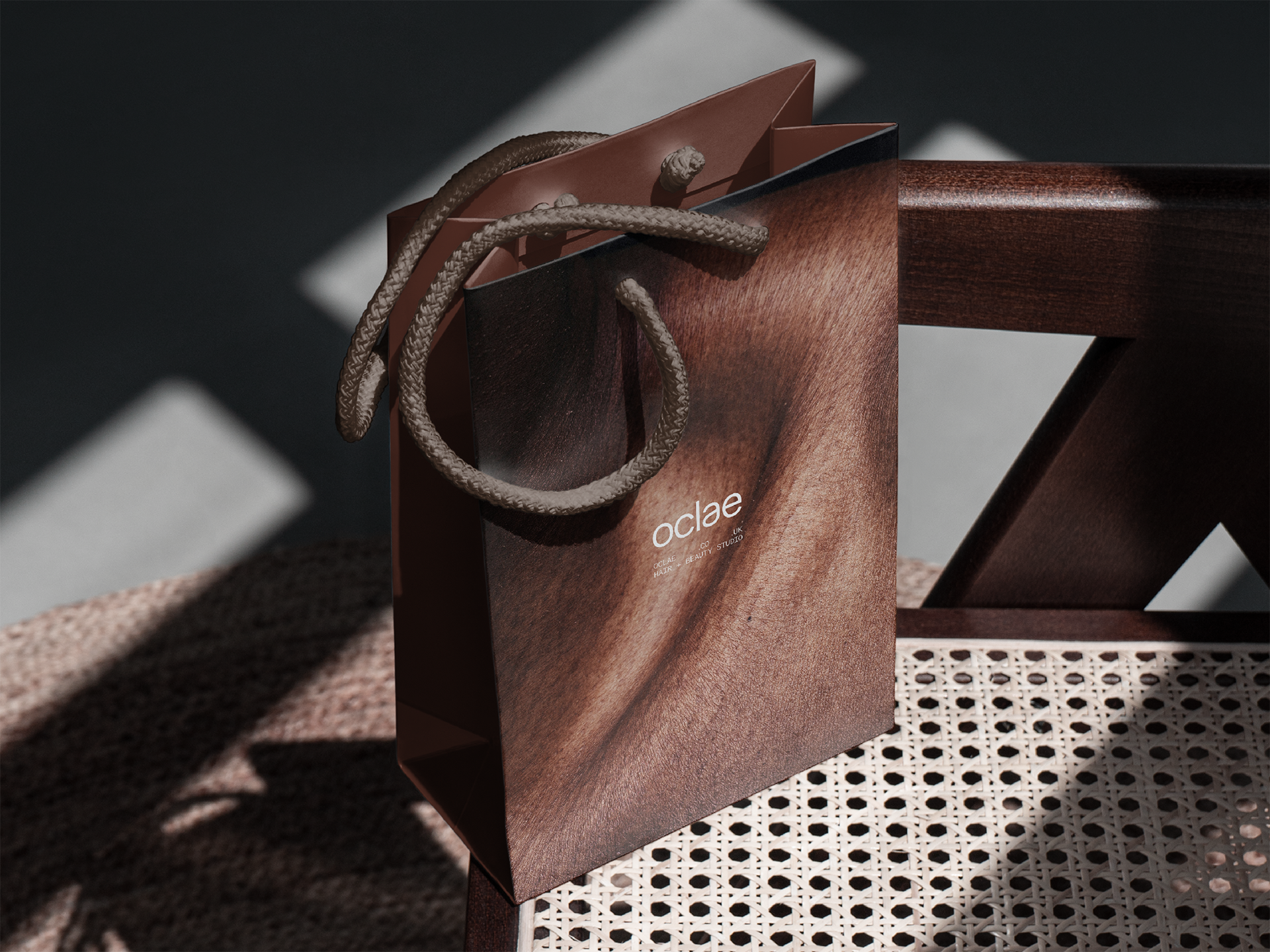
The brand identity builds on this idea in an intentional way. A minimalist lowercase wordmark reflects calm and simplicity, with a custom “a” formed from a continuous line to subtly suggest a strand of hair, openness and flow. It is paired with a flexible bubble graphic that adapts across formats. This visual device nods to cleansing, transformation and cleansing.
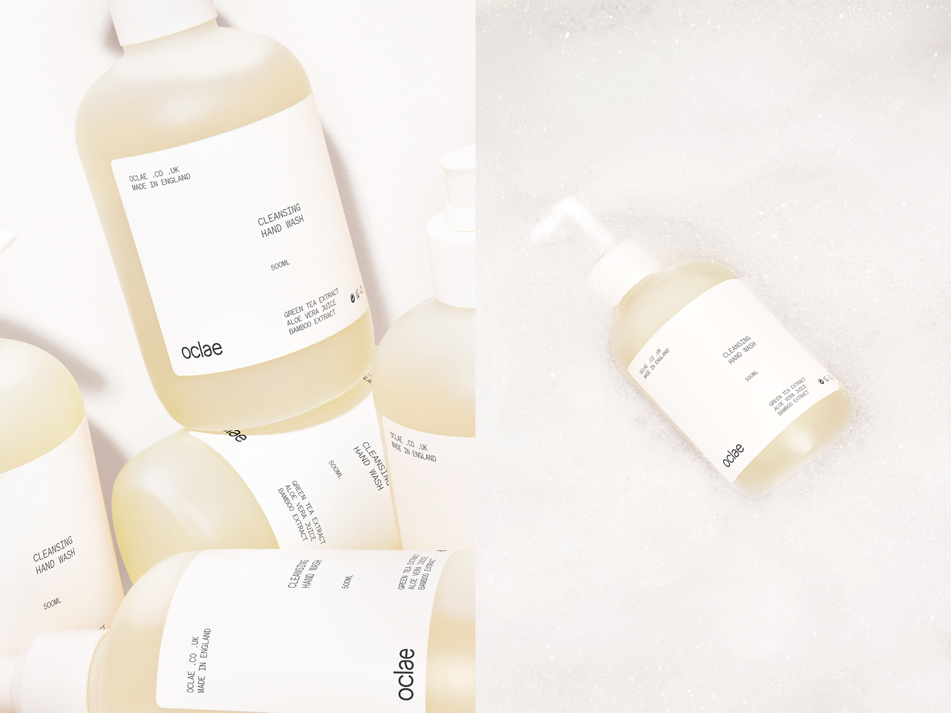
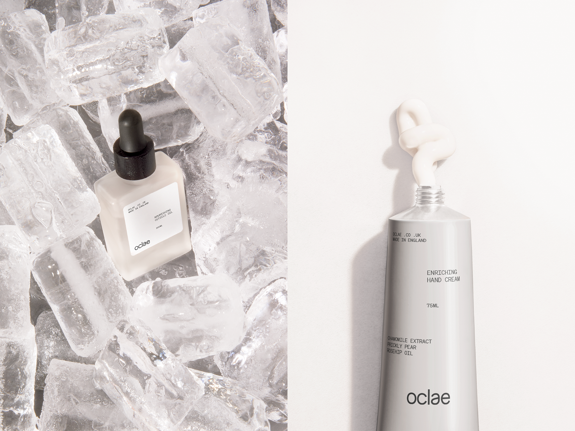
We also developed concept mockups for a potential line of branded skincare products, offering a glimpse at how the identity could extend into future offerings. The result is a quietly distinctive identity that resonates with design-conscious beauty and wellness consumers. Every part of the brand is designed to feel calm, clear and quietly confident.